LMD GridPack Guide
Introduction
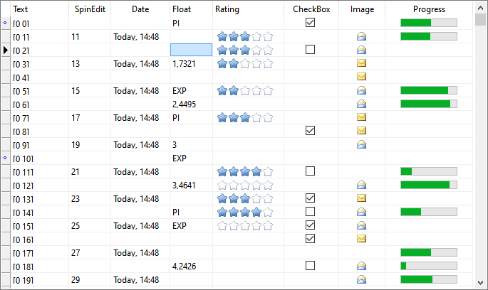
LMD-Grid is a set of components which allows to organize application data in a grid-like format using various types of built-in grid columns. Grid data is Variant based, with Null values support; User can select and edit data, sort rows, reorder and resize columns:
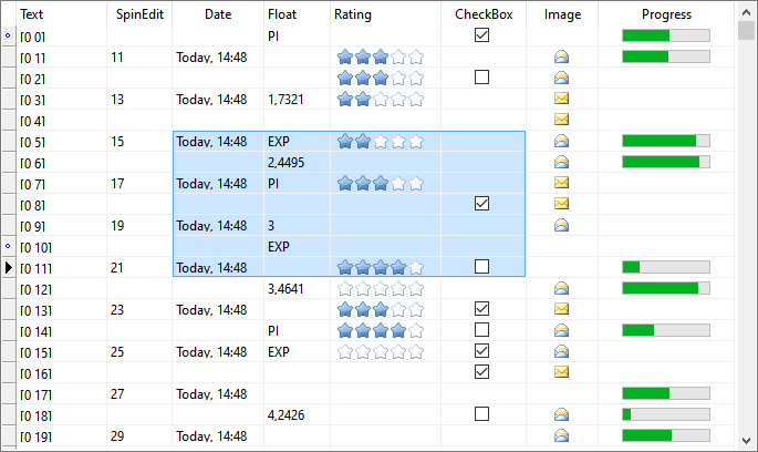
Grid supports multi select mode, in which a selection rectangle allows to select more than one value:
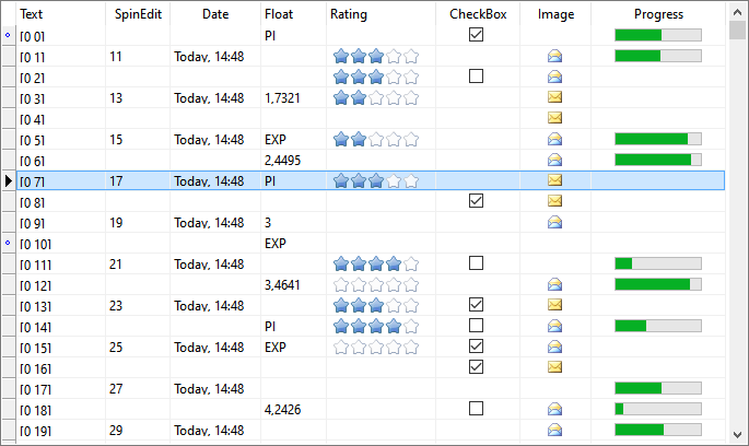
"Row select" mode is also supported, in which only whole rows may be selected:
The optional indicator column shown at the left side can be used to highlight current row state:
•Normal: 
•Editing: 
•New row: 
Row state highlighting can be useful for database applications, because commonly most data validation occurs for the whole row, and the data is committed to the server on row-by-row basis.
Data Editing
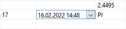
Built-in inplace editors allows to edit data directly in the grid. Various choosers (drop-downs) allows to simplify and speed-up values editing:
LMD-Grid provides the following columns:
•Text column;
•Spin edit column;
•Date column;
•Checkbox column;
•Floating numbers column;
•Image column;
•Rating column;
•Progress bar column.
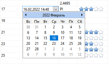
LMD-Grid provides the following choosers (drop-downs):
•Date chooser, which is actually a calendar;
•Calculator chooser;
•Pick list, which is a simple drop-down list;
•Memo chooser, for editing long text values;
•Custom chooser, which is an event based fully custom chooser; Use OnChooserShow chooser's event to show and handle your own custom drop-down.
The chooser for a particular column can be specified at design-time using Chooser column property. Not all choosers are compatible with the particular column type, so the drop-down list of choosers, shown in the object inspector, includes only compatible ones.
Despite the big variety of column types, our goal was to implement inplace editors for all columns. This means that unusual columns can also be edited; for example, progress bar column value can be changed, clicking on the progress bar at one or another point; rating column value can be changed by clicking on a star or pressing "0" to "5" key on the keyboard. The only column, which has no corresponding inplace editor - is the image column; However, even its values can be edited using choosers (drop-down list).
Null values
LMD-Grid package fully supports the notion of Null values. The classical understanding of Null values - is to treat these values as "unspecified" or "undefined". So, the best way for showing such values - is to draw them as empty white cells:
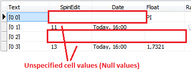
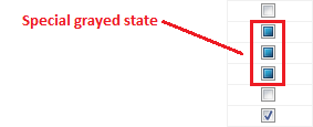
The principle of drawing Null cells as an empty white cells is held for any column type, including specific columns, like progress bar or rating columns. This way seems to be most natural way from the user viewpoint. Check box column also follows this principle by default, however, it has another commonly used option for showing Null values as special "grayed" state; this option is supported via DrawGrayed column's property:
For most columns the value can be reset back to Null value by pressing Del key.